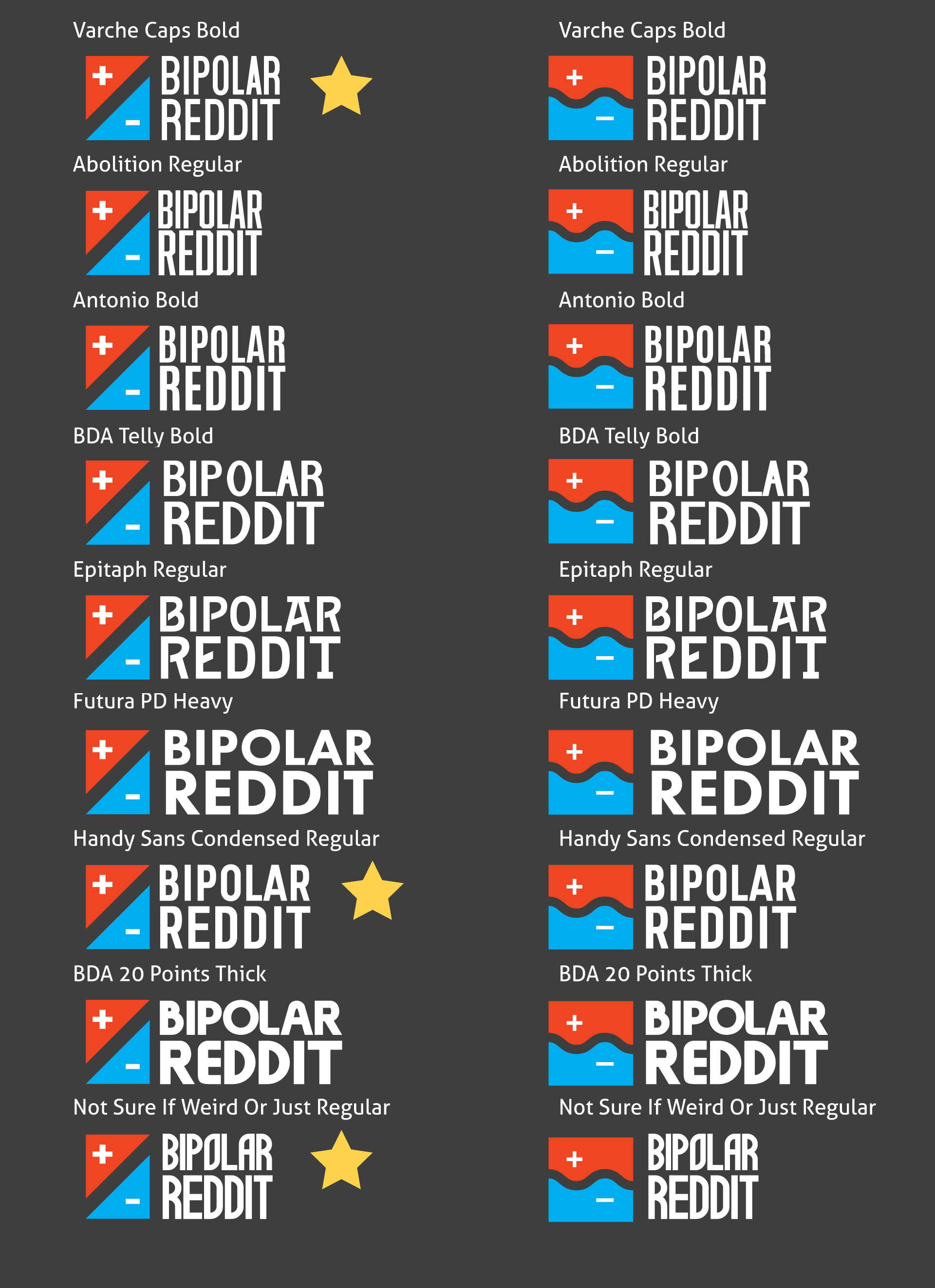
BipolarReddit is a subreddit forum dedicated to discussing the experience of living with Bipolar Disorder. The moderators wanted something simple and easy to comprehend on the first glance. For the illustrative portion of the logo, the visual concept of waves is emblematic of the bipolar experience for some. For some, it can be smooth, for others, the rise and fall can be quite sharp. The design went through a healthy number of iterations before the final was decided.
The colour scheme relies on strong contrasts. The red-orange tone represent the hypomanic space while the blue represents the depressive. Gradients were applied to accentuate the myriad feelings of entering these states. The defining dark colour is not black but charcoal, leaving the idea of ash where the lines meet in the middle.
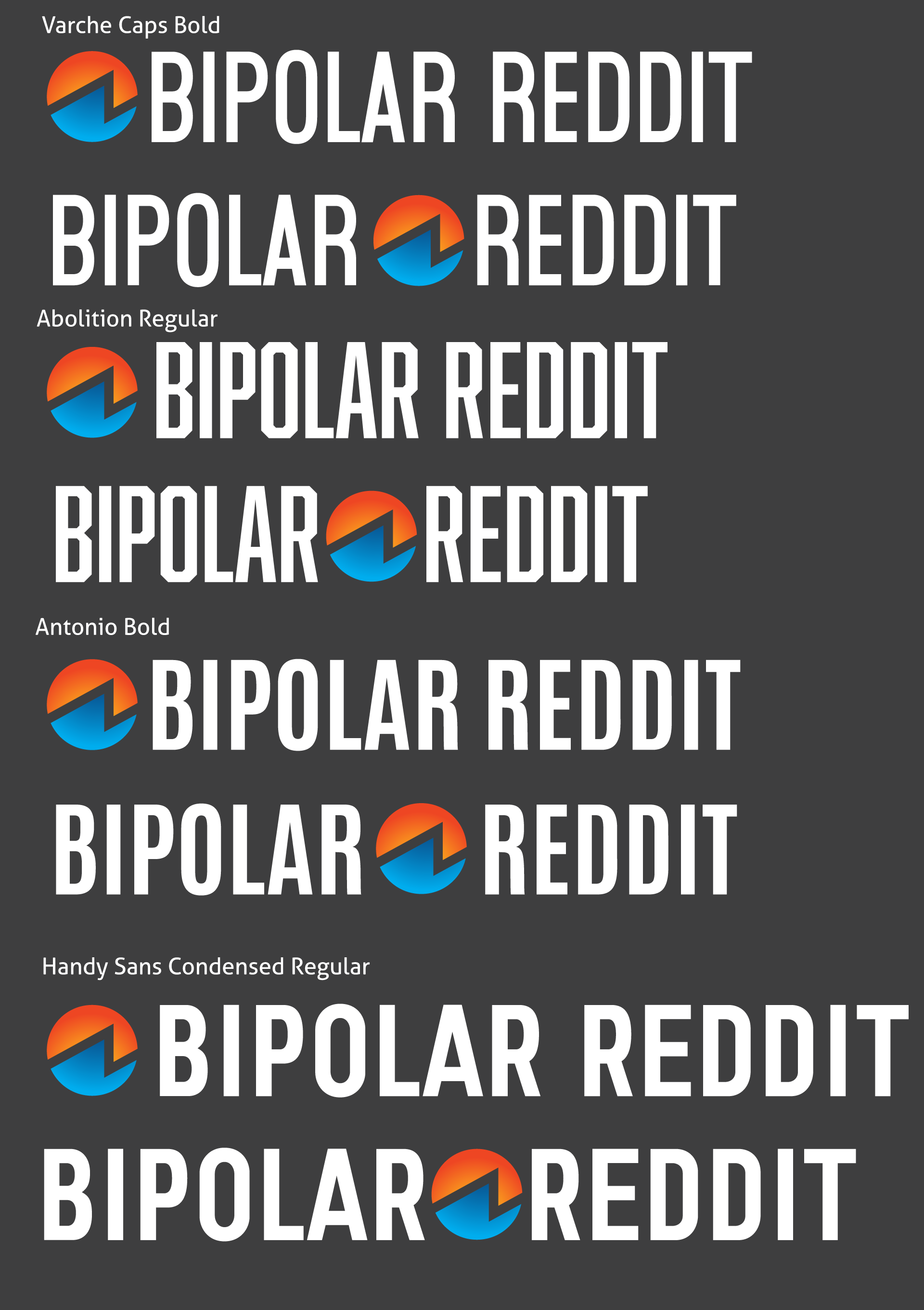
Selecting the right typeface meant keeping width in mind. While many different typeface and image pairings were developed, the Abolition typeface developed by Mattox Shuler ultimately won out. The use of the lines variation allowed for creating a three dimensional effect to the type with the white against the charcoal.

Rectangular logo typeface exploration
